Just Shipped 10 Shadcn Checkbox Components
Checkboxes are one of the most common UI elements in web applications. Whether you’re building a settings page, a signup form, or a task manager, you’ll probably need them at some point.
Instead of creating every checkbox from scratch, you can use ready-made Shadcn Checkbox components that are easy to customize and work well with React, Next.js, and Tailwind CSS.
Let’s Explore Shadcn CheckBox Now

Here are 9+ useful checkbox components you can use in your next project.
Shadcn Checkbox with Different Sizes
Need small checkboxes for tables or larger ones for mobile screens? This component includes multiple size options that fit different layouts.

Shadcn Vertical Checkbox Group
Display several options in a clean vertical list. Great for forms, surveys, or settings pages.
Shadcn Colorful Checkboxes
Add different colors to match your design system or highlight important options in your interface.
Shadcn Todo List Checkbox
A simple checkbox made for task lists. Perfect for productivity apps and personal planners.
Shadcn Checkbox List Group
Group multiple checkboxes together in an organized layout, making it easier for users to select several options.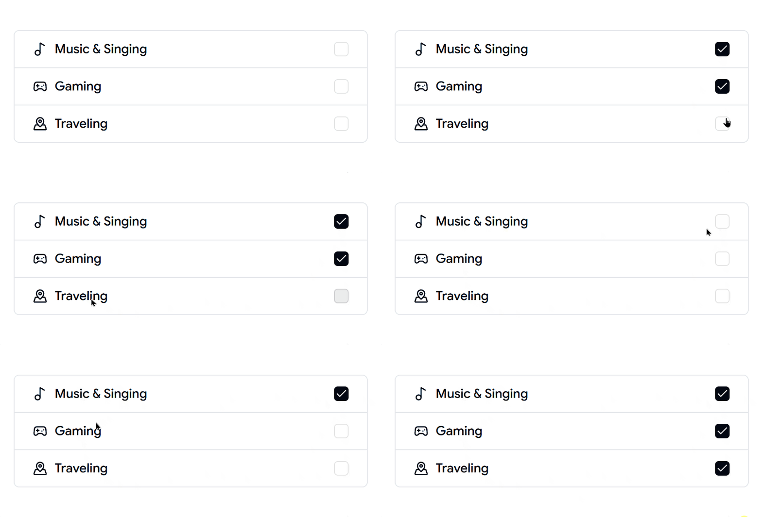
Shadcn Checkbox Inside Forms
Designed for forms where users need to accept terms, subscribe to newsletters, or choose preferences.
Shadcn Checkbox with Custom Icons
Replace the standard checkmark with custom icons to create a more unique and engaging UI.
Shadcn Dashed Border Checkbox
A modern checkbox style with a dashed border that works well in creative dashboards and modern web apps.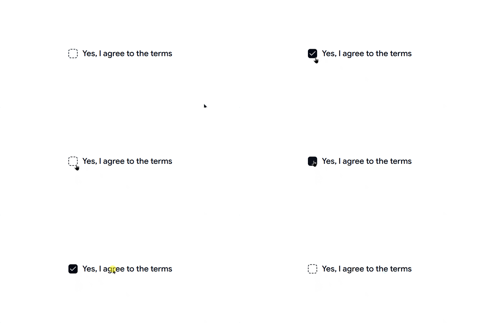
Shadcn Tree Checkbox
A nested checkbox component that lets users select parent and child items. Useful for permissions, categories, or folder structures.
Avatar Selection Checkbox
This checkbox component shows user avatars with the checkbox. It can help users pick team members, assign tasks, or manage groups more easily.
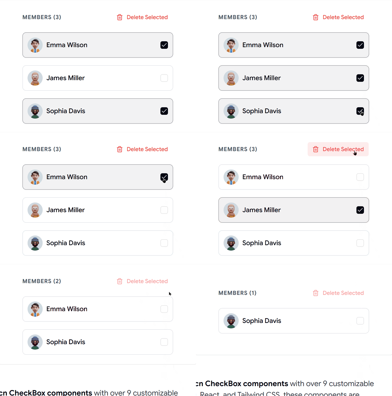
Seeing the profile image makes it faster to recognize people.
- Shows avatars with checkboxes
- Good for team member selection
- Responsive layouts
- Easy React setup
- Modern collaboration feel
Best For: Use this component for team tools, collaboration apps, task assignment screens, and communication platforms.
Why Use These Shadcn Checkbox Components?
These checkbox components can help you:
Build forms faster
Create cleaner settings pages
Handle multiple selections easily
Build task management features
Improve user experience
Save development time
Final Thoughts
Even though checkboxes are small UI elements, they play an important role in everyday applications. Having reusable components makes development much faster and keeps your interface consistent.
If you’re building with React, Next.js, and Shadcn UI, these 9 Shadcn checkbox components are a great starting point for forms, dashboards, settings pages, and many other projects.


Comments
Post a Comment